Subscribe Now - Standard: only $299 per year or Premium: only $399 per year - Click Here
|
|
Login:
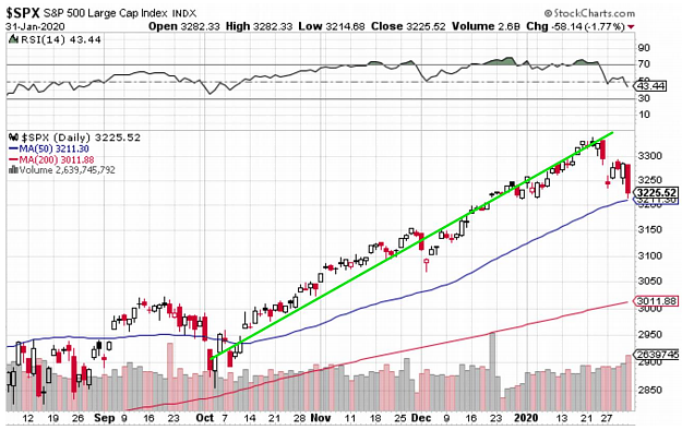
January 2020 CommentaryThe final Q4 and 2019 GDP numbers were released this week, and the economy is holding steady above 2% (currently around 2.3%). With both the GDP and employment numbers stable, the stock market has remained high. For nearly all of January, we had one new high after another (refer to daily S&P 500 chart below). Then this week the Coronavirus has pushed the stock market down. Today was the largest down day since August. Perhaps this 4-month uptrend is over.
 Today gold was up even though the markets were down big. This is what I expected. The gold fear-trade seems to be in play. Investors have been moving to gold for several months now, with gold maintaining a $1500 level. This high gold price has occurred even with a strong stock market. Usually, gold trades down when the stock market is strong. That did not happen in 2019, so why should it happen in 2020? Another good sign for gold is that has maintained its price level even with a strong dollar. The dollar index is currently above 97 and gold closed today at $1580. We might see 98 or 99, but 100 seems unlikely. The odds are better that the dollar weakens, especially if the stock market falls. Any weakness in the dollar should push gold higher. So, fundamentally, gold has a nice setup for higher prices. With just a little bit of weakness in the stock market and gold should rise due to the fear-trade and a weaker dollar. It will not be a big surprise if we close above $1600 in February. If that happens, then silver will finally confirm gold's breakout. The silver chart below (from a Tweet by Graddhy) shows the huge potential of silver. This chart (Quarterly since 1972) looks like silver is primed to break out big. Once we get past $22, it is clear sailing. Anything above $18.50 has to get you excited. 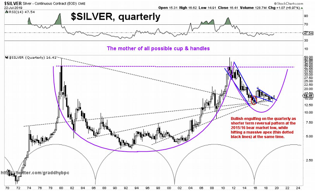 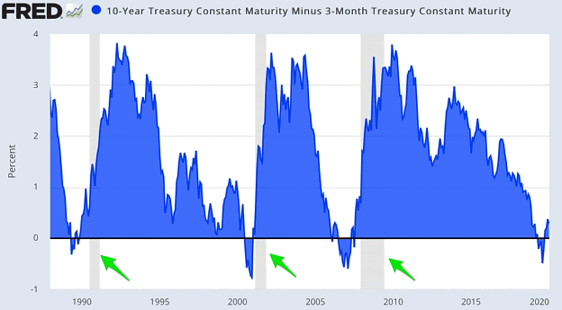 So, if gold is going to get above $1600 and silver above $18.50, we need the U.S. economy to weaken and the U.S. stock market to weaken. The chart above shows when the 10-year Treasury versus the 3-month Treasury has been inverted. It also, show recessions in grey (green arrows). Notice the current recent inversion. That's a good sign of a looming recession. 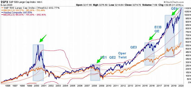 The chart above shows the Nasdaq (dark blue line) and several light blue boxes (green arrows). The boxes are 2 standard deviations above the 200 WMA. We are currently touching that box again. Usually this marks a top in the stock market. 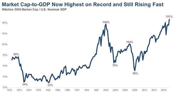 The chart above shows that the U.S. stock market valuation is 151% of the the U.S. GDP, which is the highest it is has ever been. Thus, it is historically overvalued. 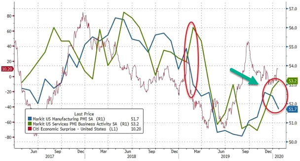 The chart above shows a mixed picture of the PMIs (see green arrow). The services PMI was up in January. However, the manufacturing PMI was down and showing weakness. 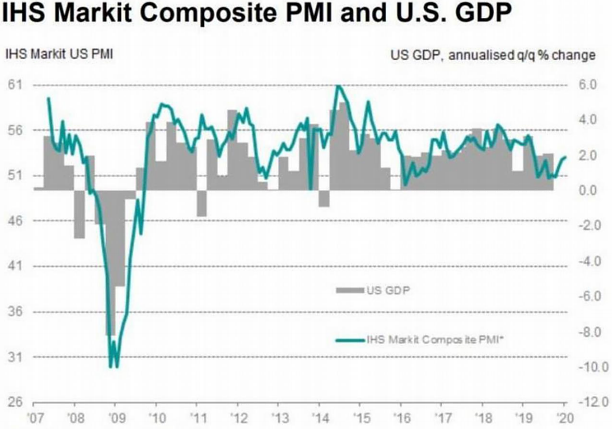 The chart above shows a composite PMI and US GDP. Both are muddling along. If we are going into a recession, then they will both turn negative. The PMI could easily turn negative (sub 50) from its current level. 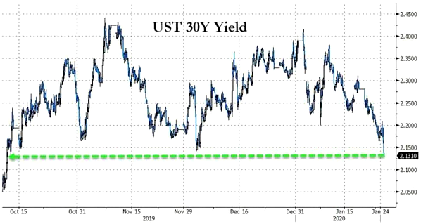 The chart above is the 30-year Treasury yield. Notice downward trend. This trend seems to imply a weakening economy. 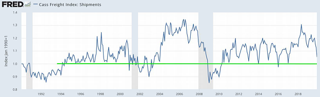 The chart above is the Cass Freight index, which shows shipments inside the U.S. (trucks, trains, plains). It is currently possitive, although it is also trending downward. Notice that the past downtrends have all tested 1.0, and below 1.0 usually signal a recession. 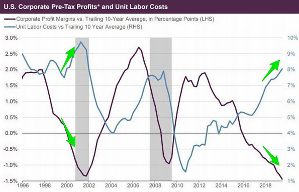 The chart above is perhaps the most powerful chart in this month's newsletter. It is the comparison of corporate profit margins (10 year avg) versus labor costs (10 year avg). For the last two recessions, once profit margins (10 year avg) dropped below zero, layoffs began. We have been below zero for more than 3 years! The only reason, layoffs have not began is the huge number of zombie companies (estimated to be around 30%, who aren't profitable). But this chart implies that the end is nigh for the labor market. 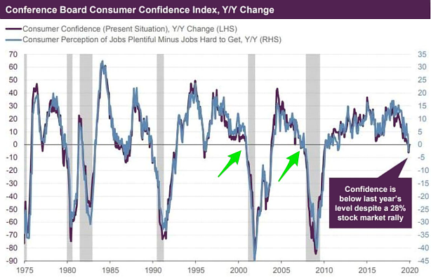 The chart above compares Y/Y consumer confidence and recessions. For the last two recessions, once consumer confidence drops below zero, a recession will begin shortly after. Look at the current numbers. 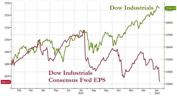 The chart above is another powerful indicator. It shows a comparison between the stock market and corporate profits (EPS). Clearly, there is a huge divergence. 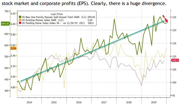 The chart above shows that new houses are still trending upward (green line). However, pending home sales haven started to plateau (orange line). One thing that is clear to me, once the jobs numbers weaken, so will housing. To conclude, the economy has not rolled over yet, but there are signs of an impending recession. The Fed is clearly accommodating and will do everything they can to keep the economy stable. We may go several more months before the signs are clear that gold is going higher. But 2020 so far looking like a good year for gold and silver. My hope is that the silver chart continues to paint that massive cup and handle pattern. |
Follow