Subscribe Now - Standard: only $299 per year or Premium: only $399 per year - Click Here
|
|
Login:
February 2020 CommentaryIt's Friday, the 28th. After this morning's mauling of gold and silver (both down 5%+ this week) due to the Corona virus, I had to re-write my opening. First of all, I was wrong. I thought that gold and silver would rise this time when the stock market had a sell-off. I thought the fear-trade would kick-in and push them both up, especially gold.
What I learned today is that gold is not a hedge for a stock market sell-off. If you want a hedge for that, then you need to be short a stock index or own the VIX. What drives gold is the fear-trade, but fear of what? Bonds failing! There is much more money invested in bonds than stocks, and that money is invested for safety! When the last stock market crash occurred in 2008, gold and silver crashed as well. I should have learned then what I learned today. Gold and silver didn't rally until after the crash, when the fallout for bonds began. After the crash, investors worried about their bonds and bought gold and silver. Then, after the markets recovered, gold and silver started their 7-year bear market in 2012. The signs were there that gold and silver would fall with a market crash. The biggest sign, which I have repeated over and over, is that silver has not yet confirmed a new gold bull market. Based on my analysis, it was not time yet to go all-in with the miners or call options. The good news today is that bonds are now weakened psychologically. That means there is a good chance investors will begin buying gold to protect (hedge) their bonds. Others will sell their bonds and buy gold. Others will buy gold instead of more bonds. In other words, the fear-trade is likely to manifest in the coming months, unless the markets do a quick recovery. Let's looks at a few charts for posterity. The first one is the S&P 500 (see below). This is the weekly chart (for last week) going back to 2007. We are currently at 25,000 and under the 200 WMA (red line). If you look closely, you will see that this is the first time we have been under the 200 WMA since 2011! That is when the fear-trade that pushed gold to an all-time high died. This week (or this sometime year) the fear-trade may have come back to life. We will know soon enough. 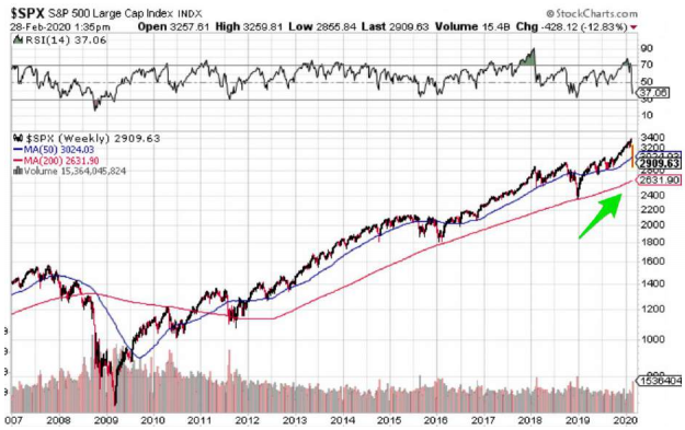 The next chart is the HUI (the large cap miners index). Interestingly, the HUI's 200 WMA held today. But it is at 211, which is terrible. The miners still have awful sentiment. That could change quickly if the bond market stumbles and there is a run to gold. I've always said the key to high gold prices will be bond defaults. The only time big money wants gold is when they are nervous about bonds. 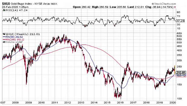 Let's also look at the gold chart, which is actually still strong. Remember, we were in a long channel dating back to 2013 that broke out at $1375 (see green lines below). We are still way above the channel and way above the 200 WMA. Still a good sign, so don't despair. 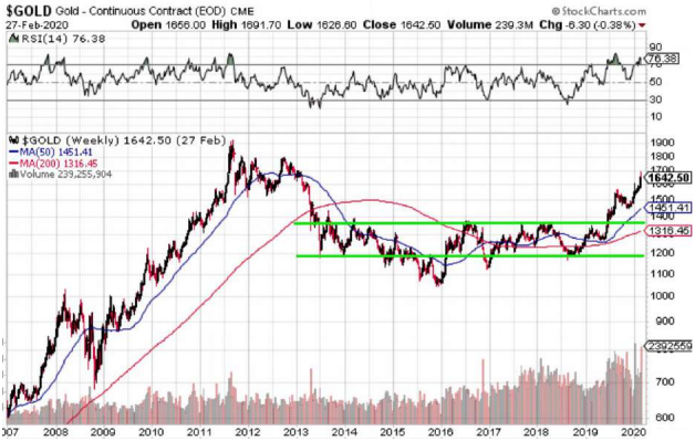 Amazingly, as strong as the gold chart looks, the silver chart is still weak (see below) and has not broken out. Notice the bottom of the channel (green lines). The bottom should hold, so we are getting close to a bottom. If silver goes to $15.50 or $15, that is probably a good buy price. Load the boat! 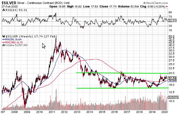 The Corona virus is creating havoc with the markets. It is clearly a black swan that no one expected. At this time, we don't yet how much of an impact it will have the rest of the year. What we do know is that it looks like a possible global pandemic and could easily create a recession. I would expect the Trump administration and the Fed to be accommodative to prevent a recession. The Fed has shown its hand, lowering rates three times in 2019. And Chairman Powell has reiterated that it will do everything it can to prevent a recession. However, this virus could be beyond the control of the Fed. We already have weak economic numbers, and are on the precipice of a recession. So, unless this virus slows down soon, the odds are increasing that we will see a recession this year. The chart below shows year-on-year profit margins for non-financial corporations. Notice what has occurred prior to the last three recessions (green arrows). Every time was had a prolonged downtrend in profits, it ended in a recession. 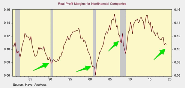 The Microsoft weekly chart (share price) below is from last week. Does this chart reflect a period of lower earnings? It blasted off in 2016, when the earning weakness began. This chart's straight-up direction is the same for all of the FANG stocks. Clearly, it is (or was) a bubble. 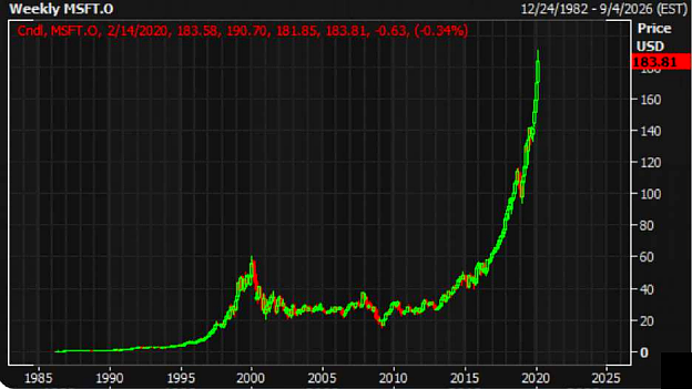 Below is a chart that shows the DOW in green (29,384) and DOW EPS (1621) in red. This shows how the stock bubble intensified in 2019. The crash this week is starting to bring it back into balance, but it has a long way to go. Where has this stock market bubble come from? The Fed's easy money policies (low interest rates), share buybacks, and investor's thirst for momentum. 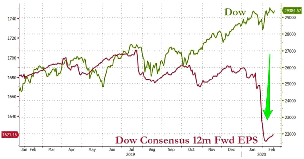 The chart below shows the PMI data for services (green) and manufacturing (blue). Both are now at recessionary levels (which is considered sub 50). These are likely to drop in March and April from the Corona virus. 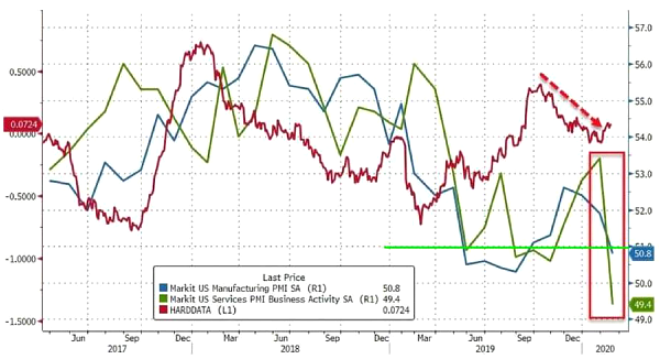 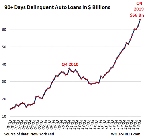 The chart above shows auto loan payments that are overdue 90 days. If the economy is strong, then why is the chart exploding? Warren Buffett has said that his favorite indicator for identifying if the stock market is overvalued is the overall stock market cap/GDP ratio. He likes it to be around 70% to 80% when he is buying. Until this recent correction, it was getting close to 200%. This is why he has been accumulating cash (over $100 billion) and didn't buy many stocks the last two years. So, we have weakness signs in the economy, yet the stock market continues to rise. Something has to give. This virus could be the pin that pops the bubble. The chart below is another sign of economic weakness. The 30-Year US Treasury bond continues to trend lower. Note that this rate is entirely driven by market factors. The Fed has control over short-term rates, but not much on the long end. I don't know about you, but a 1.9% 30-Year yield seems pretty crazy. 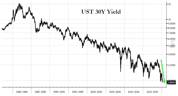 The chart below (the green line is new home sales) shows that those low rates are allowing people to buy new homes. What happens if rates rise? 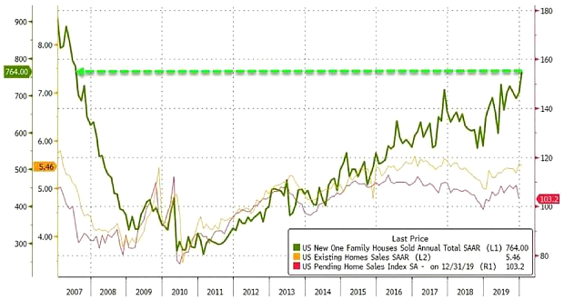 The chart below shows S&P 500 cash flow (year-on-year) versus the ISM (manufacturing PMI number). The green arrows show where recessions have occurred (or could occur). When ISM/PMIs fall sub 50, cash flow tends to go negative. We are knocking on that door again. 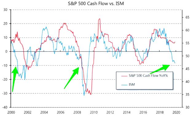 I showed a lot of economic charts last month as well. Go back and read that newsletter to get a better overview of the economy. There is weakness everywhere. The only thing that has kept us out of recession is accommodation by the Fed. The Q1 print for GDP should come in sub 2%. If the Corona virus does not diminish soon (and it appears to be increasing), then the Q2 print for GDP will even worse. So, where does gold and silver fit into this situation? I think they go lower in the nearterm if the markets continue to sell-off. But if the bond markets weaken, I expect gold to be a hedge against bond defaults. Also, if you look at the overall global bond market it is about $100 trillion in valuation, and much of its value based on rosy economic scenarios. We have negative rates on bonds throughout the world. That is all based on pie-inthe-sky economic assumptions. If confidence breaks in the bond market, gold will take off. Worse case, I expect it to trend higher at some point this year. I am amazed the GSR (gold silver ratio) is currently 95, and silver is sub $17. Why can't silver get a bid? Why would an institution or billionaire load up on risky bonds when they could buy some silver at below $17? It's crazy to me. Ironically, once silver gets into the 20s, its chart is going to look fantastic and everyone will want to own it. My favorite chart at the moment is the silver chart. There is very little technical resistance from $22 to $50. Why? Because silver has not spent much time above $20. The chart below shows how strong gold has been since 2009. This chart is about a week old. It shows that gold is at an all-time high in every currency except five. Many countries are seeing big gains in gold in their currency. As they say, the trend is our friend. 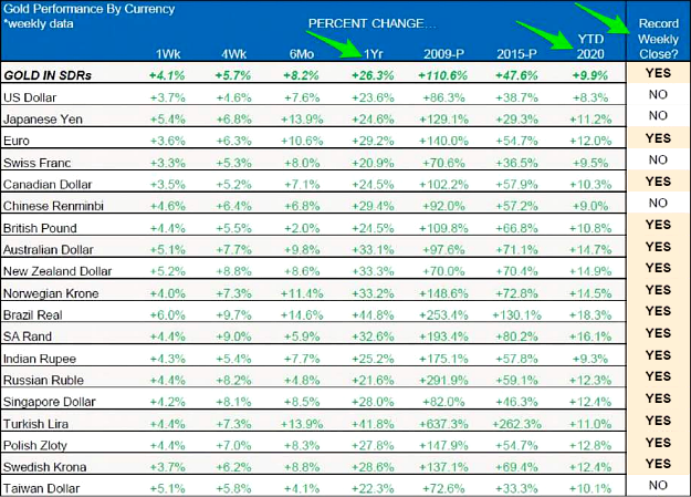 Below is a chart showing that Goldman Sachs is calling for $1800 gold due to the Corona virus and low real rates. March could be a very good month for both gold, silver, and the miners. It could be the month that silver finally breaks out and confirms the gold breakout that occurred at $1375. I would have never expected the GSR (Gold Silver Ratio) to be at 95 when gold reached $1600. That is stunning to me. However, that has created a coiled spring for silver. We could see silver jump from $18 to $22 in only a few weeks. If that happens, then silver miners will fly and the sentiment in miners will finally turn positive. Thus, we are on the threshold of a turn in sentiment that has been negative since 2013. 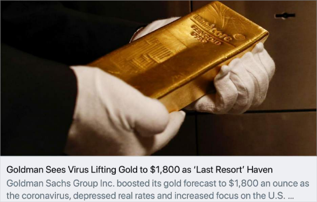 |
Follow